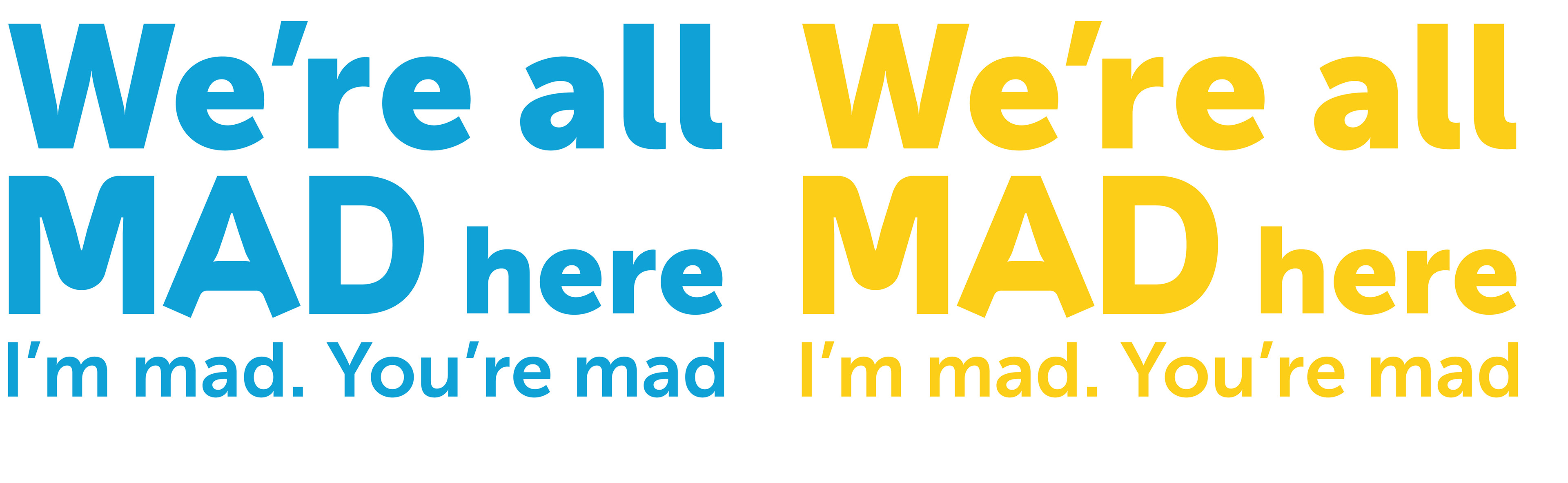
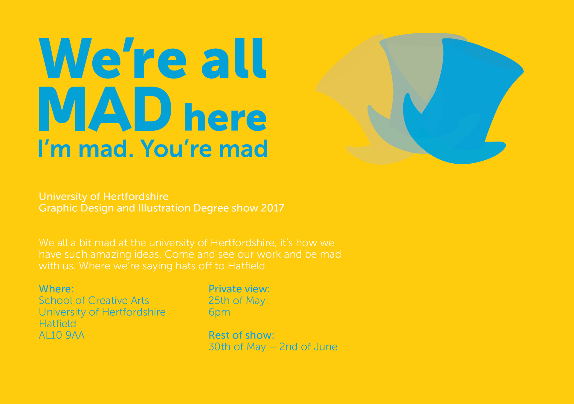
Concept
Based on the phrases said by the Cheshire cat in Alice and Wonderland “Oh, you can’t help that,” said the Cat: “We’re all mad here. I’m mad. You’re mad.” This idea came from that this course is focused on ideas, and don’t you have to be a bit mad to have great new ideas?
The identity uses the Cheshire cats signature grin and eyes, as well as the mad hatter's hats.
Progress two is used for headlines as it has a lot of character and a bit of madness and Museo Sans for everything else for clarity at small size.
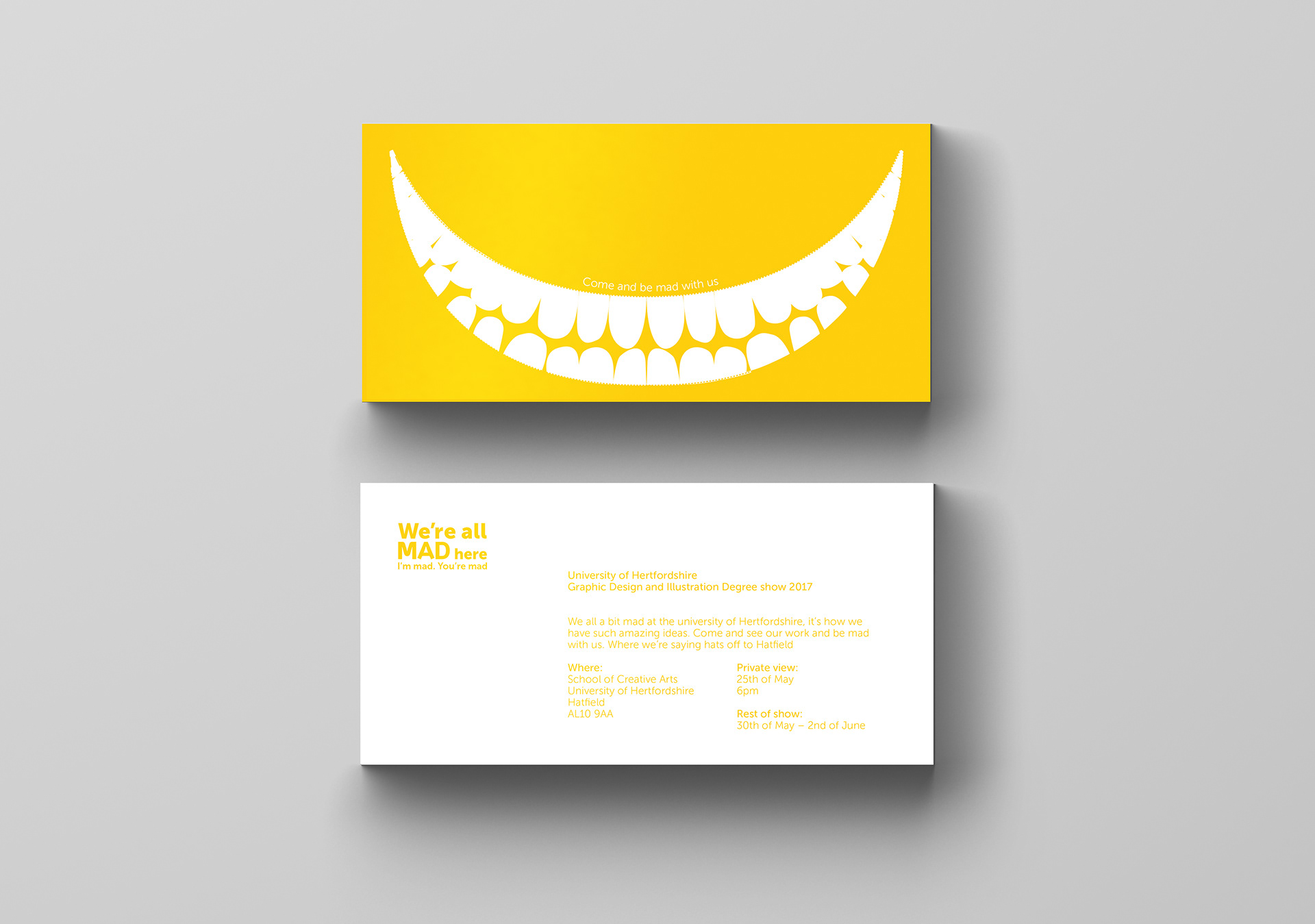
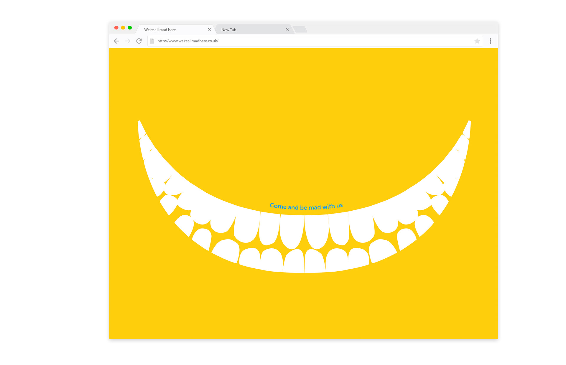
Print and online invite
The printed invites front has a perforated grin with the phrase “come and be mad with us” that is perforated, the suggestion being they can remove it from the invitation and also be mad.
The online invite has an animated hat to represent us “saying hats o to Hat eld”, it also ensures it draws attention in the same way the perforated grin does.
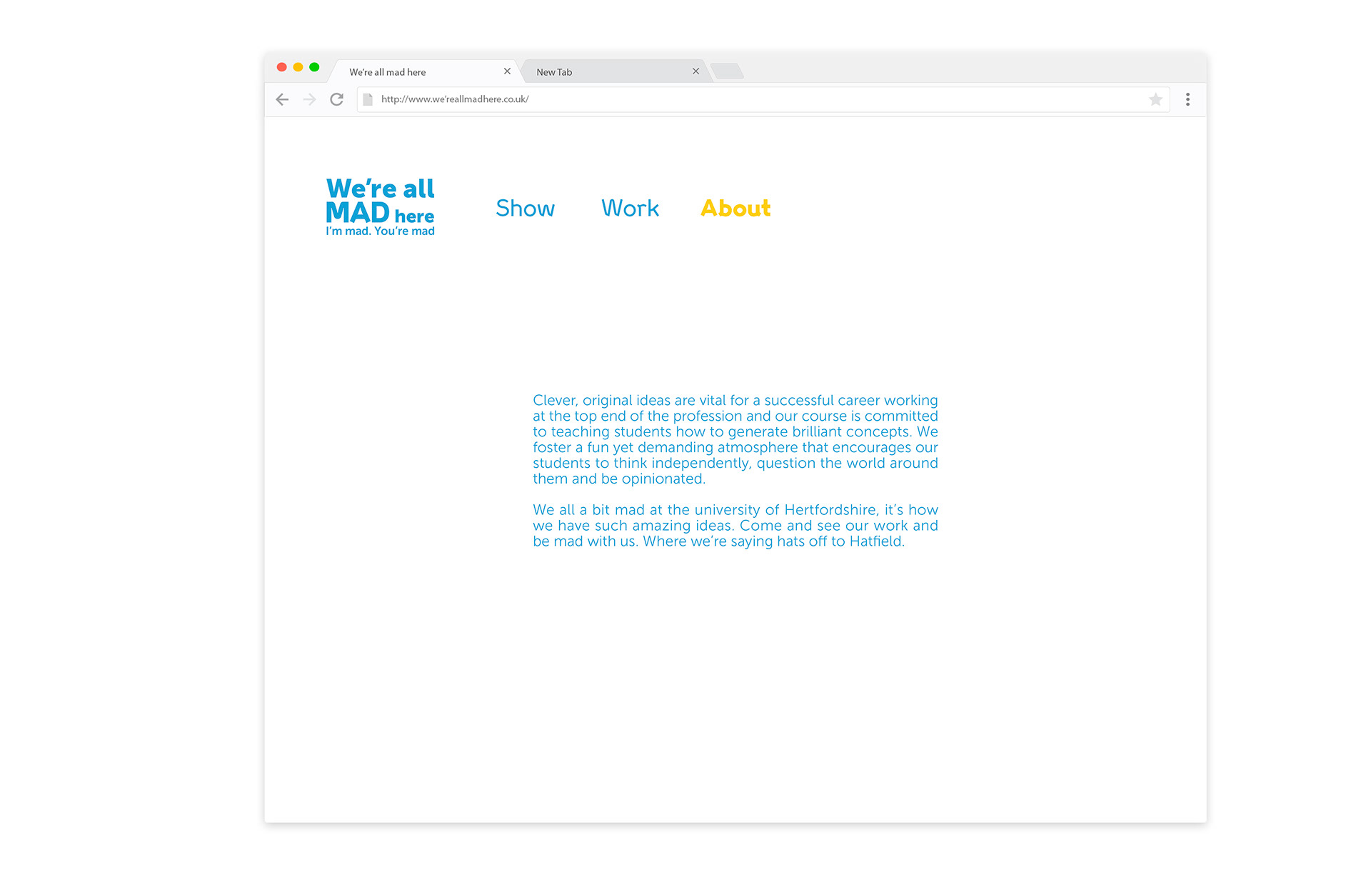
Website
The landing page starts with the grin appearing, before going into the website.
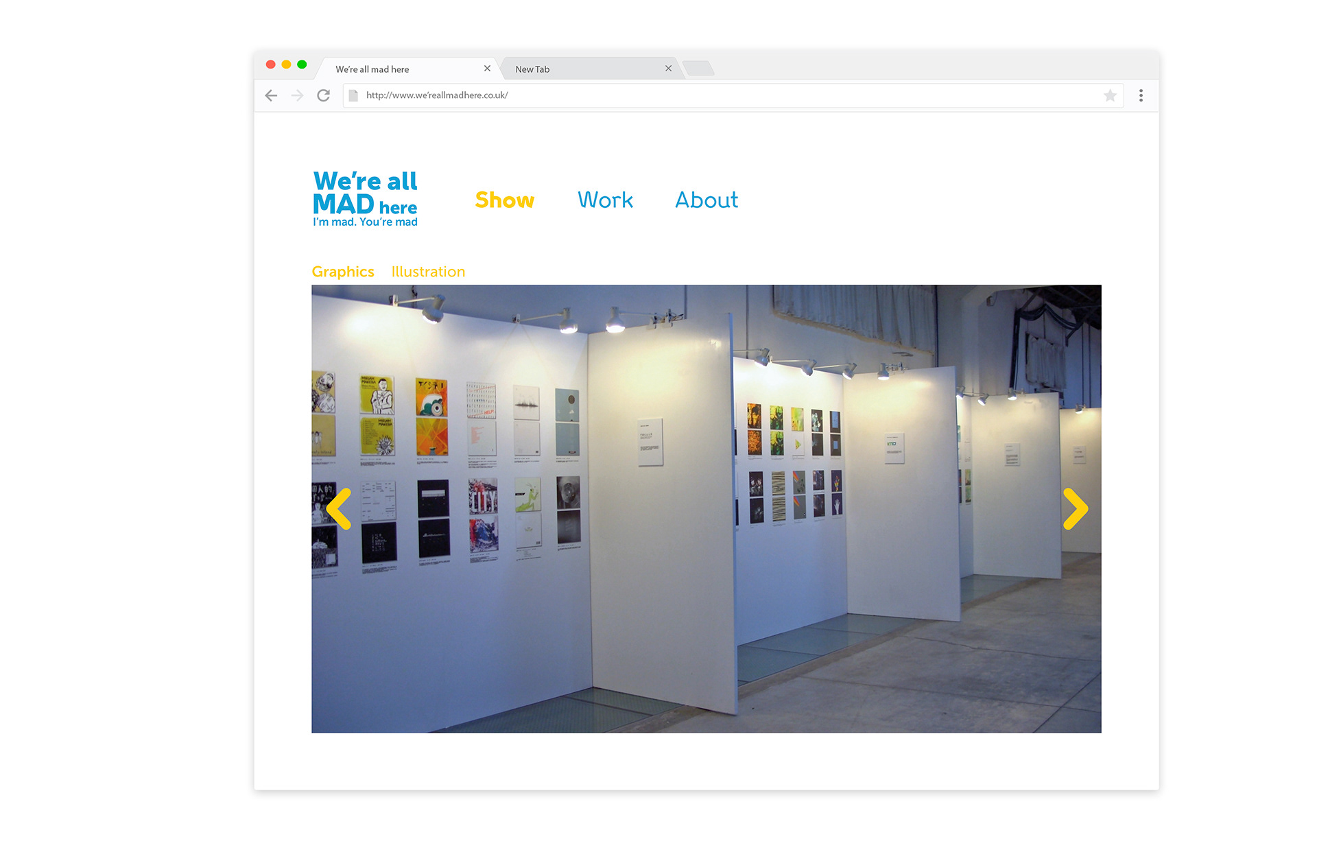
The website will show the students best work, as well as their contact information.
It will be possible to view the show through the website using an interactive 360 view so that those that can not make the exhibition can still see it.

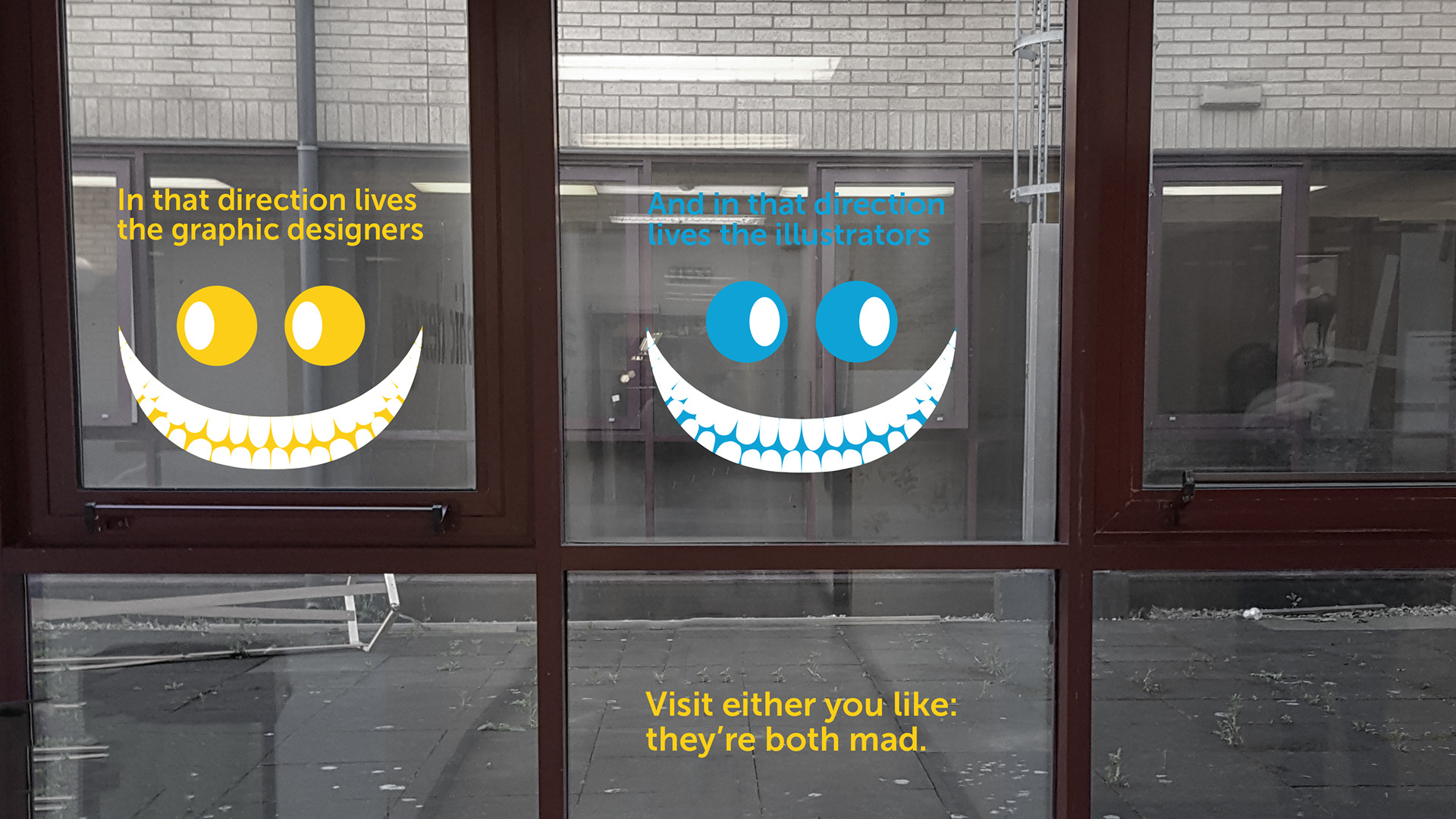
Where to go signage
The signage uses the cats eye to point to the direction of where to go. They are printed on vinyl so they can be stuck anywhere including the windows. It makes best use of the reference to the Cheshire cat by using its line in the book where it tells Alice where to go and twisting it to work as the direction for where to see the designers and illustrators work.
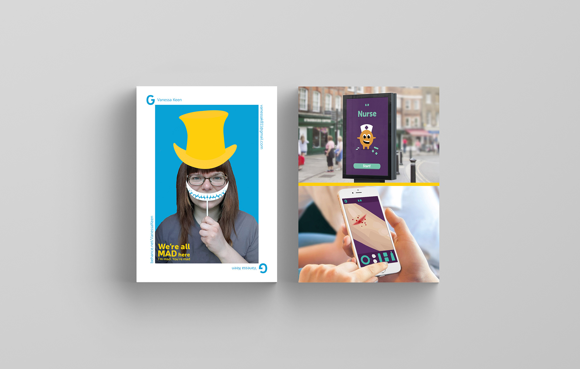
Mad grin and hat
Before the exhibition, each student would have their photo taken holding the grin to their mouth.
They would also design and illustrate their own mad hat to show their design style and wear it for the photo.
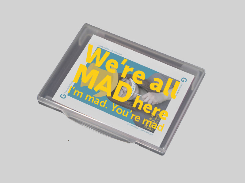
The cards
They take visual inspiration from a deck of cards. A “G” would be in the corner for the graphic students and an “I” for the illustration students. With one having blue as their main colour and the other having yellow. On the sides of the image would be information on how to contact the student.
A clear thin branded case would be used so that employers could collect the cards of the students whose work they like.
Show imagery
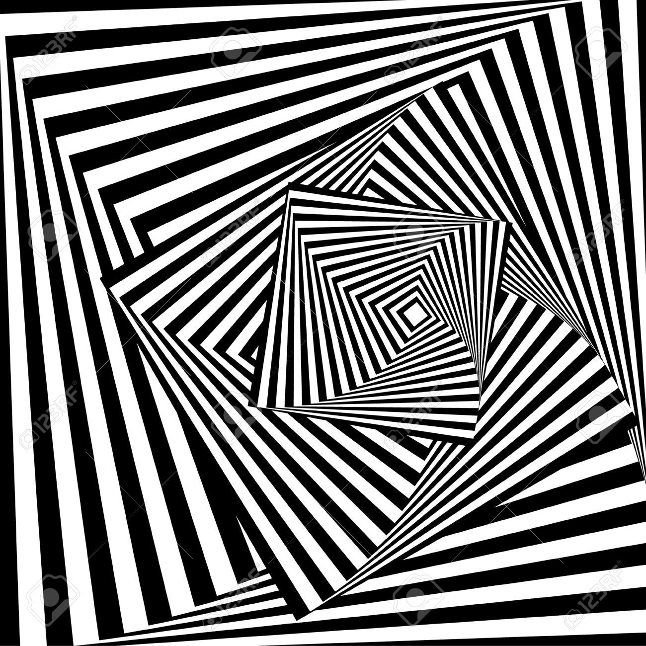
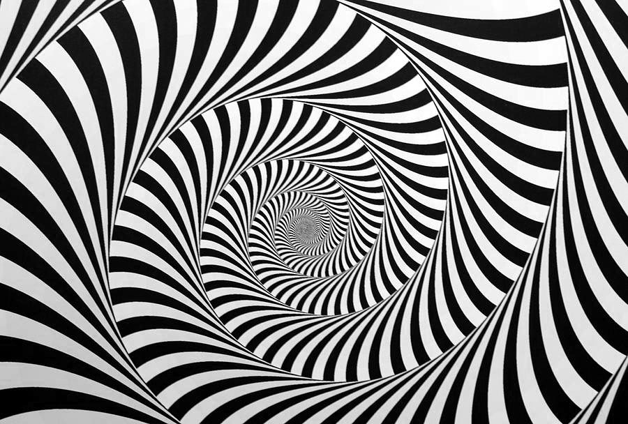
Illusion imagery would be used on the floor of the show to give the room a feeling of it moving and not being stable when they walk over it. It will add to the “mad” feeling of the room, but because it is on the floor it will not distract from the design and illustration.