
The concept
The concept of the exhibition is based off the book ‘The Island of Dr.Moreua’, it looks at modern day vivisection in the form of genetic engineering. There is one quote in particular, “Could the vivisection of men be possible?” that references that H.G.Wells was almost predicting the vivisections of humans. Although genetic engineering on the surface seems less abhorrent, it has a lot of the same ethical and moral issues. This is what lead to the exhibition idea.
The exhibition
The idea for the exhibition is that people have their photograph taken upon entry and they then go around the first room, called modify, and at each interactive display they are given different options to change themselves. This starts off small, with changing the hair, something we already do and is considered normal. However, the idea is that they are changing their genes so they can ‘naturally’ have the hair they want, without having to continuously die or straighten it. This goes all the way to the extreme of flying. Where they are given the option to add different wings so they can fly.
The idea is that they can see not only how designer babies could be created, but also that we could bring in different abilities that animals have to humans, things that wouldn’t be possible without genetic engineering. This gets them thinking about all the possibilities but also the ethical and moral issues this brings about.
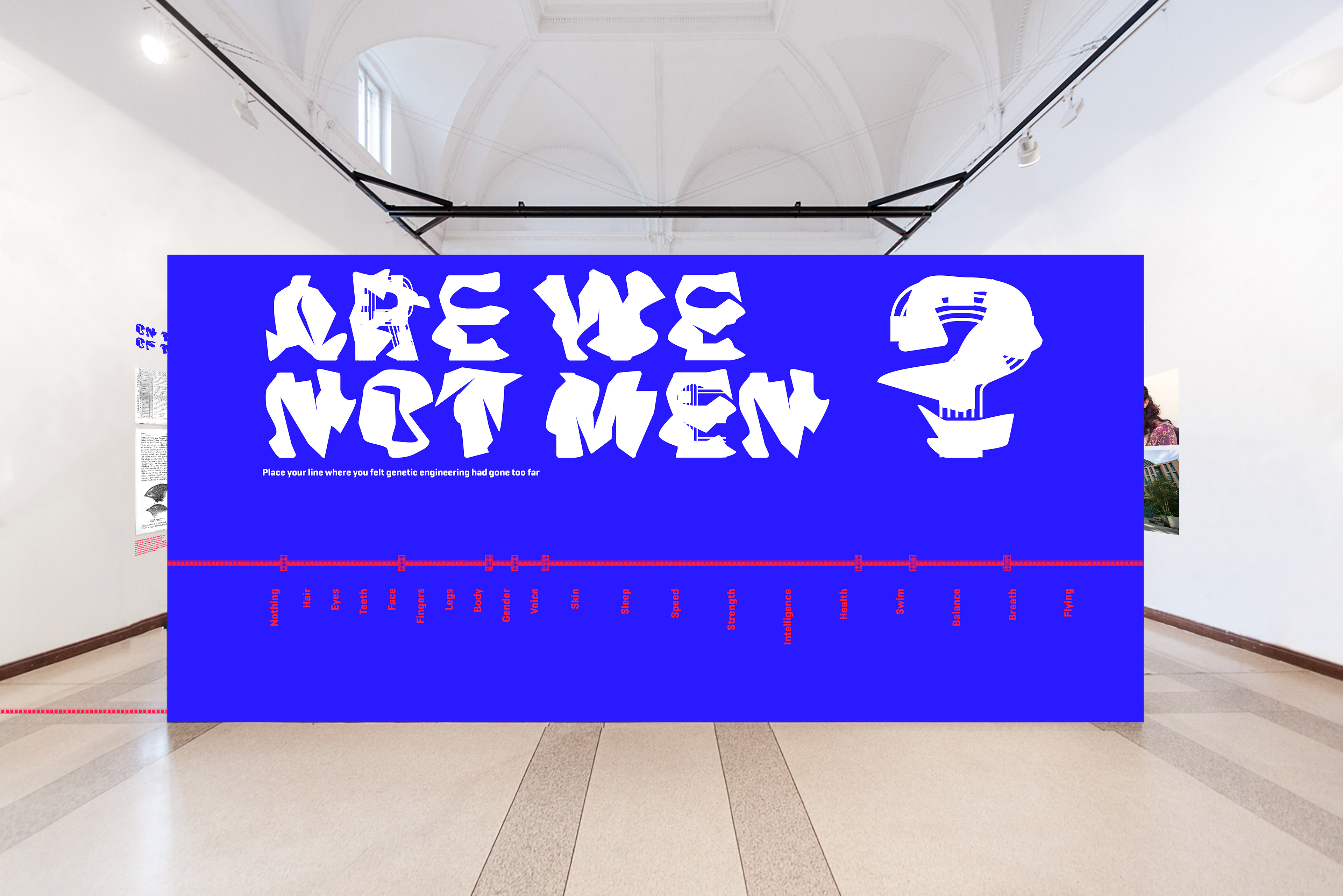
A big part of the exhibition is the line, visitors are asked to decide where they draw the line, where we would no longer be men.
The title of the exhibition comes from the book, at one point in a moving moment the beasts recite the laws:
‘Not to go on all-fours; that is the Law. Are we not Men?
‘Not to suck up Drink; that is the Law. Are we not Men?
‘Not to eat Fish or Flesh; that is the Law. Are we not Men?
‘Not to claw the Bark of Trees; that is the Law. Are we not Men?
‘Not to chase other Men; that is the Law. Are we not Men?’
As ‘Are we not Men?’ summed up the exhibition perfectly and is from the book it seemed very fitting to use it as the title of the exhibition as that is what I am asking them to decided, at what point during the process of the exhibition ‘Are we not Men?’
Typeface design
To capture the idea of people modifying themselves as they go round the exhibition I used the typeface Geogrotesque and created different modified versions, the idea being that as you progress through the exhibition, as you become more modified, so does the typeface. I used it to capture the idea of the exhibition on all the various pieces.
The posters
I have designed a variety of printed posters for different locations. They have been designed to show the typeface becoming more modified in a variety of ways depending on if multiple posters are together or not. For instance, the first one is designed so that it can be seen on its own, and still, show the modifying idea. Whereas later ones are designed to show the modification over multiple posters.

Moving posters
Another form of the posters is using the typeface morphing from the original typeface to the most modified one. This is an alternative way of showing the morphing in an eye-catching way and makes the most use of electronic posters.
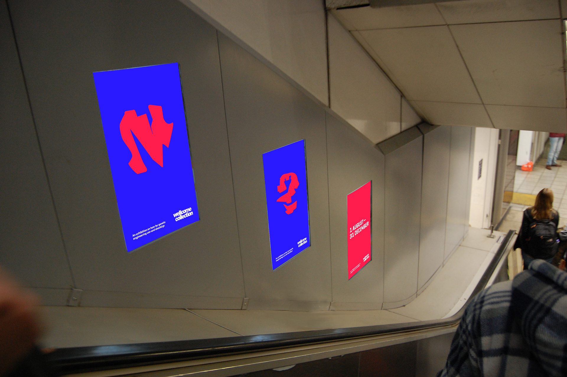
Moving posters
Other moving posters are the ones on the elevators, they would run through the advert but at a speed that allowed you to see the whole advert as you were going down the escalators. The advert makes the most of the smaller display by flicking from one letter to another, in a similar way to the social media advert seen on the next page.
Social media advert
The social media advert flips the beginning of the laws from the book around so that they are asking the viewer them. It uses the laws that make the most sense in the modern world. This makes the most of the reference to the book as they are so fitting to the exhibition and the idea that if they say yes to any that means they are not men. That if we can say no to them, then, Are we not Men?
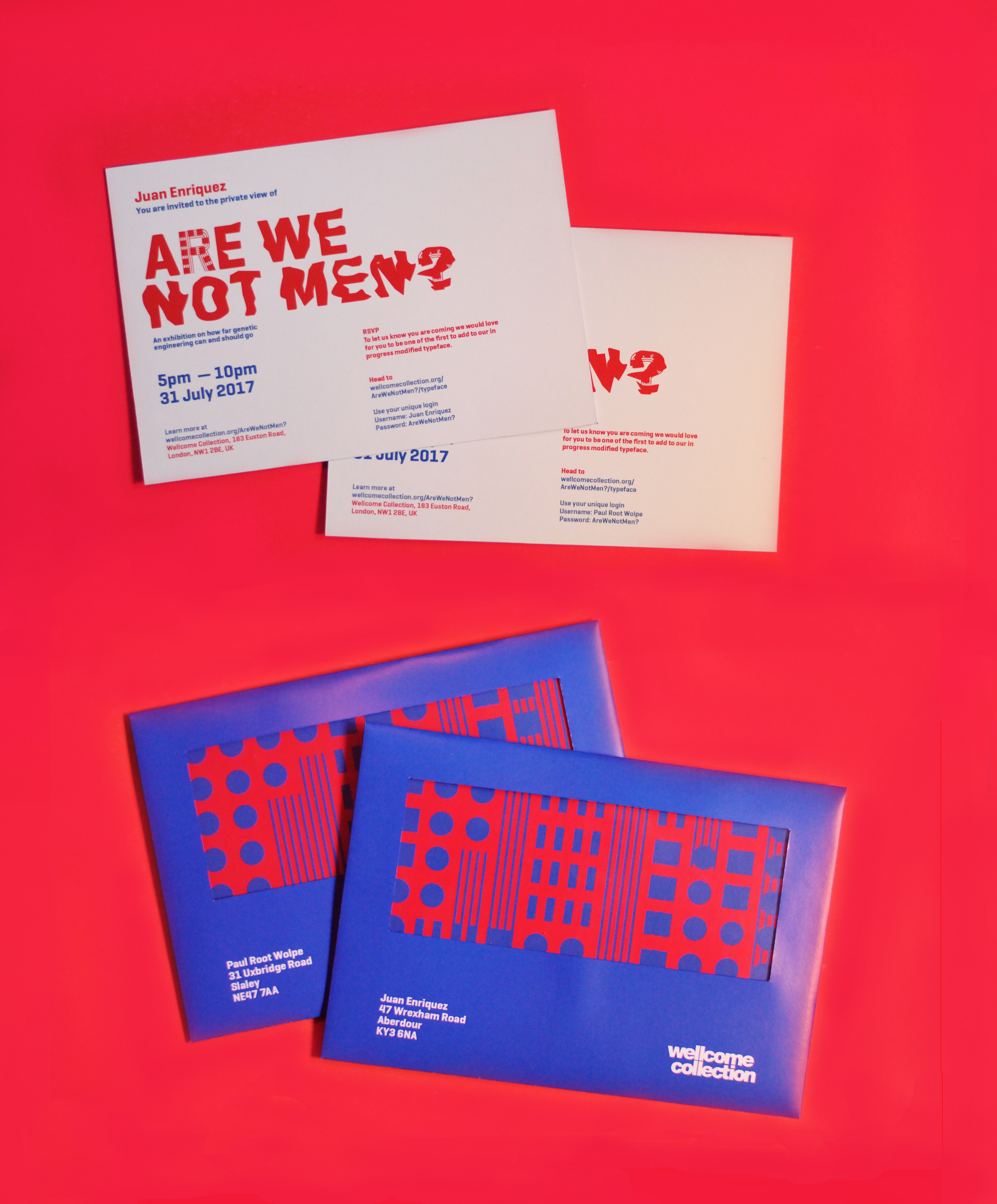
Private invite
The private invite asks the receiver to RSVP by being one of the first to modify the typeface. They are given a unique username and a password so that they can feel individual and important by being one of the first to modify it and also allows the Wellcome Collection to know who is coming.
Part of the invitation is a sticker, this has a unique pattern on it, made from the same pattern as some of the typeface. They can then bring it along to the exhibition and once they reach the question, ‘Are we not Men?’ they can place their unique sticker on the wall to give their decision. This will allow the people who came to the private exhibition decisions to stand out, helping them to feel important and privileged. It would also be interesting for the general public to see what the ‘experts’ decided.
The invite is backed onto a blue card that matches the blue in the colour scheme. This adds to the modified feel of the invitation as well as making it more luxurious.
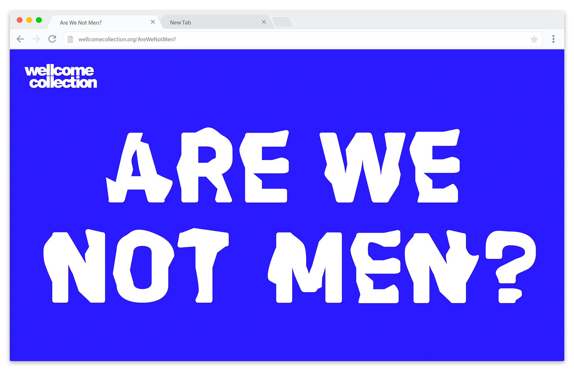
Website
The landing page for the micro website immediately shows the full impact of the typeface morphing, introducing the concept and title of the exhibition.
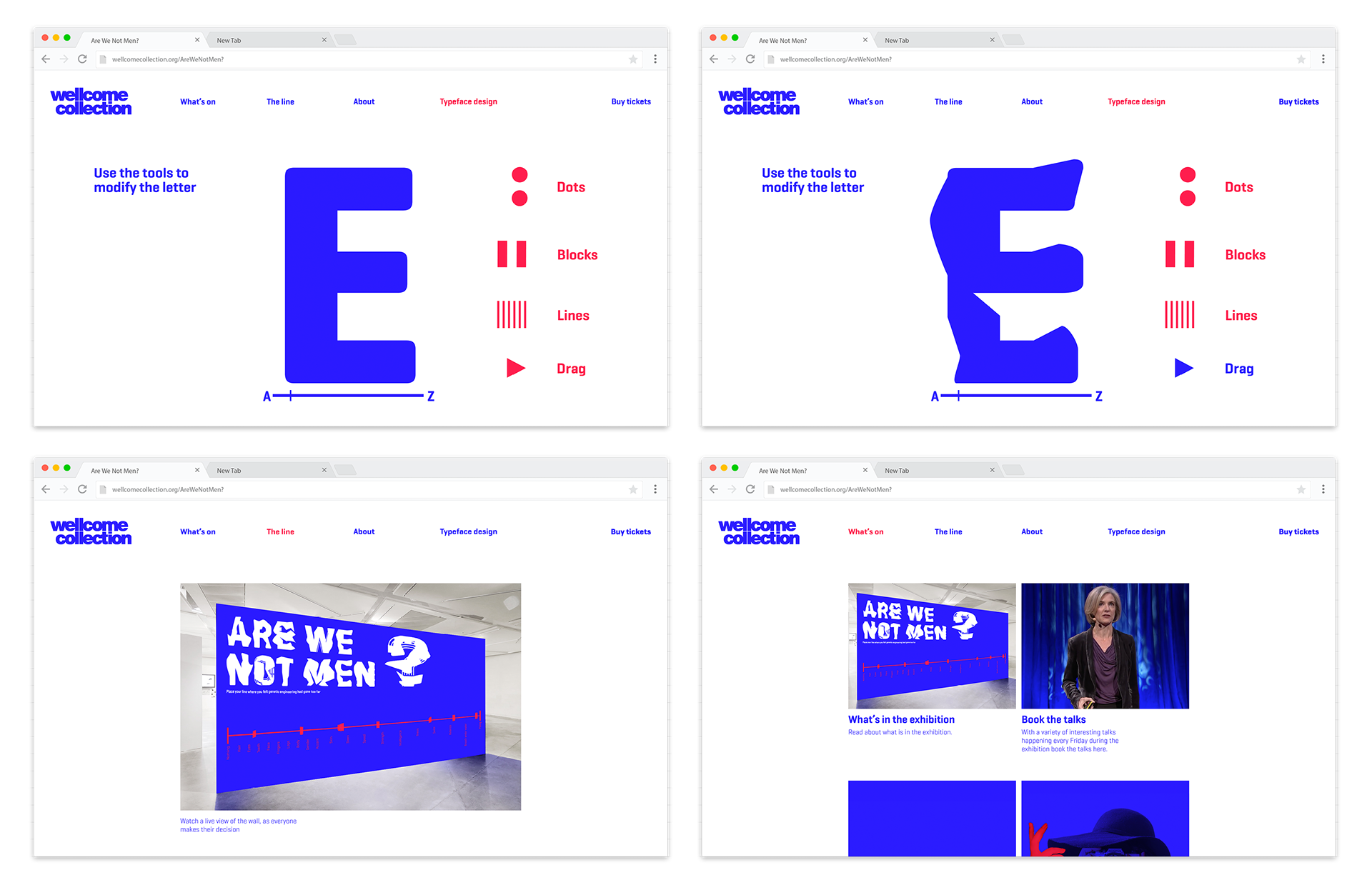
Website
On the website is where visitors are able to edit the typeface, they are limited to the tools to ensure the typeface remains certain consistency so that it all ties together.
A live view of the wall will be shown on the website as it would be interesting for those that have already been, or those planning to go, where people are placing their line to see it built up and if there is a general census.
Under the ‘What’s on’ page will be a section explaining what is in the exhibition, the discussions and what inspired the exhibition. It will also have a section where viewers can look at uploaded images that they have created in the exhibition, to show how they modified themselves.
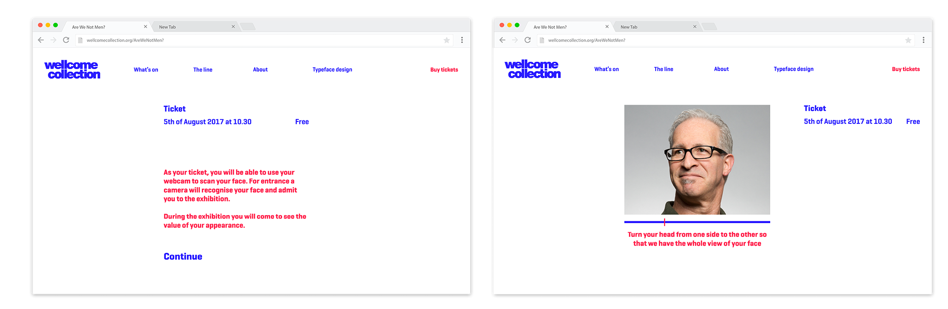
General public ticket
Tickets for the general public use their face. As appearance is such a big thing in this exhibition, to help them see the value of their appearance before they enter, they use their face as the ticket by scanning it using their webcam. At the exhibition, a camera will recognise their face and admit them.
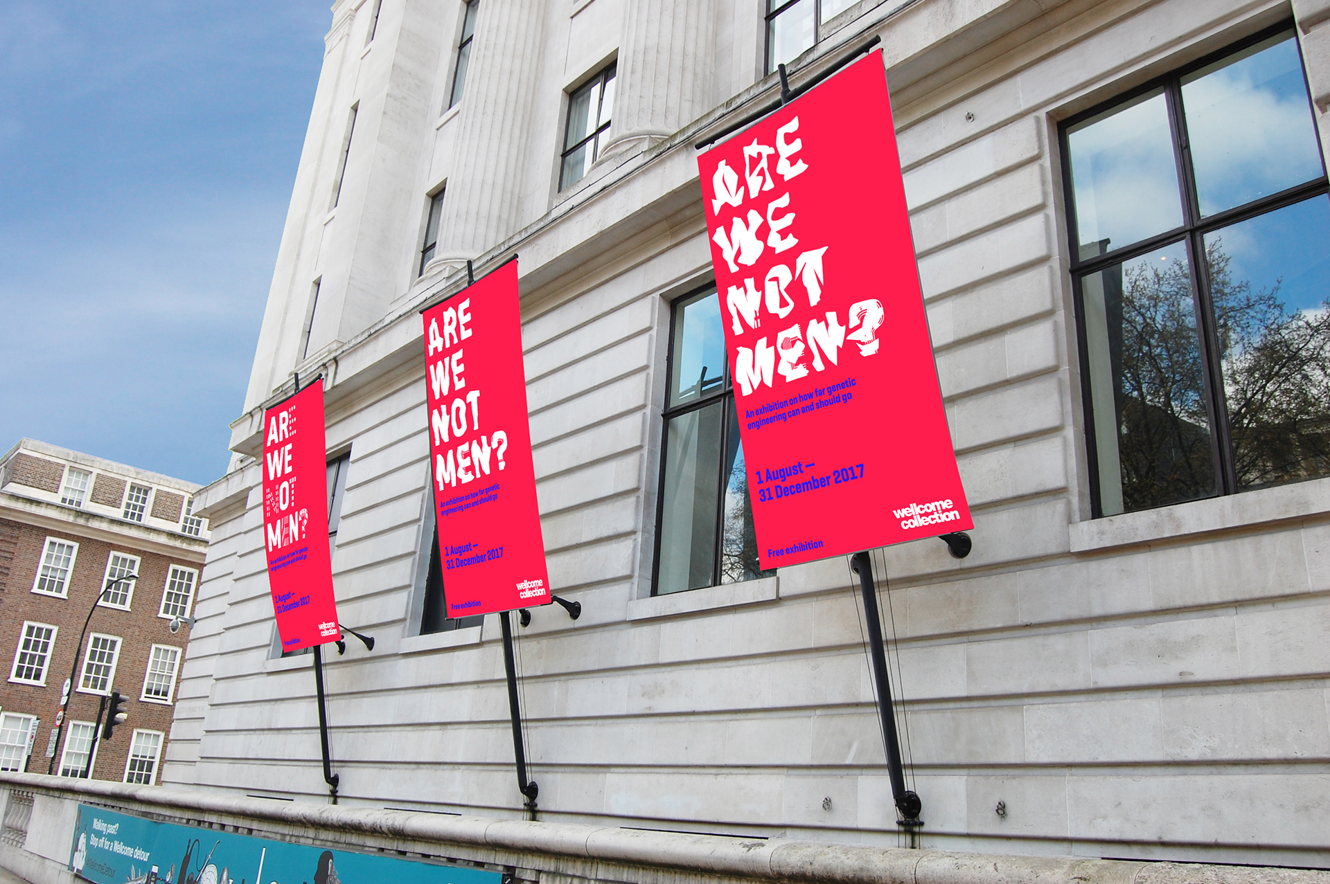
Outside signage
The outside banners in front of the Wellcome Collection are more modified as they go along. Making the most use of the banners and not having the same one three times.
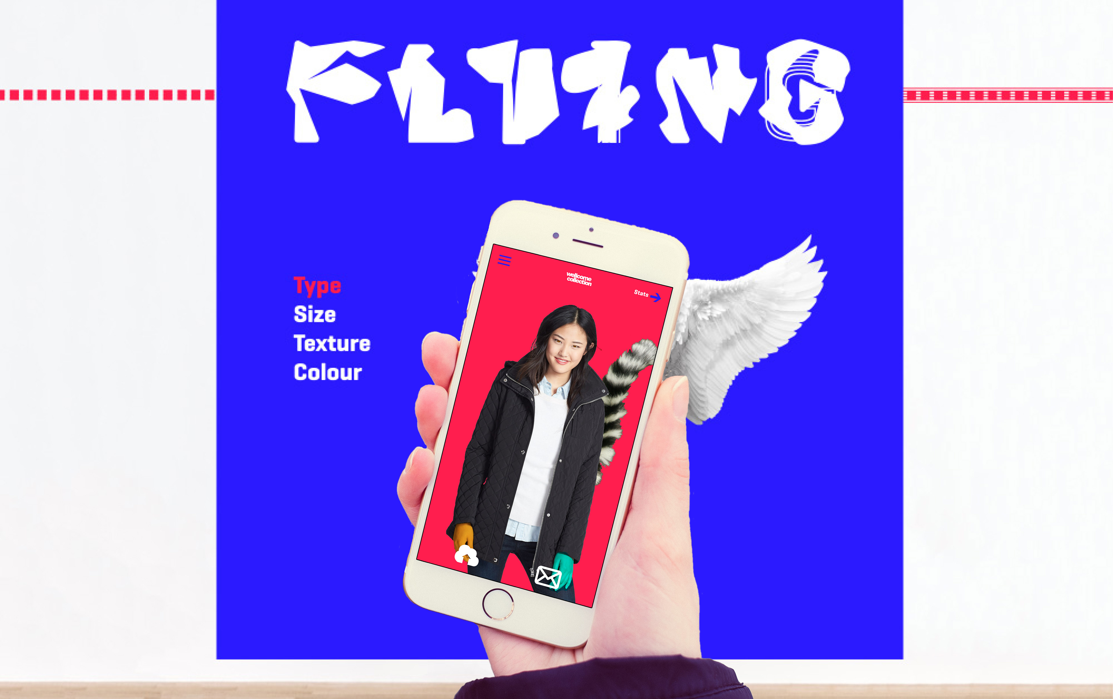
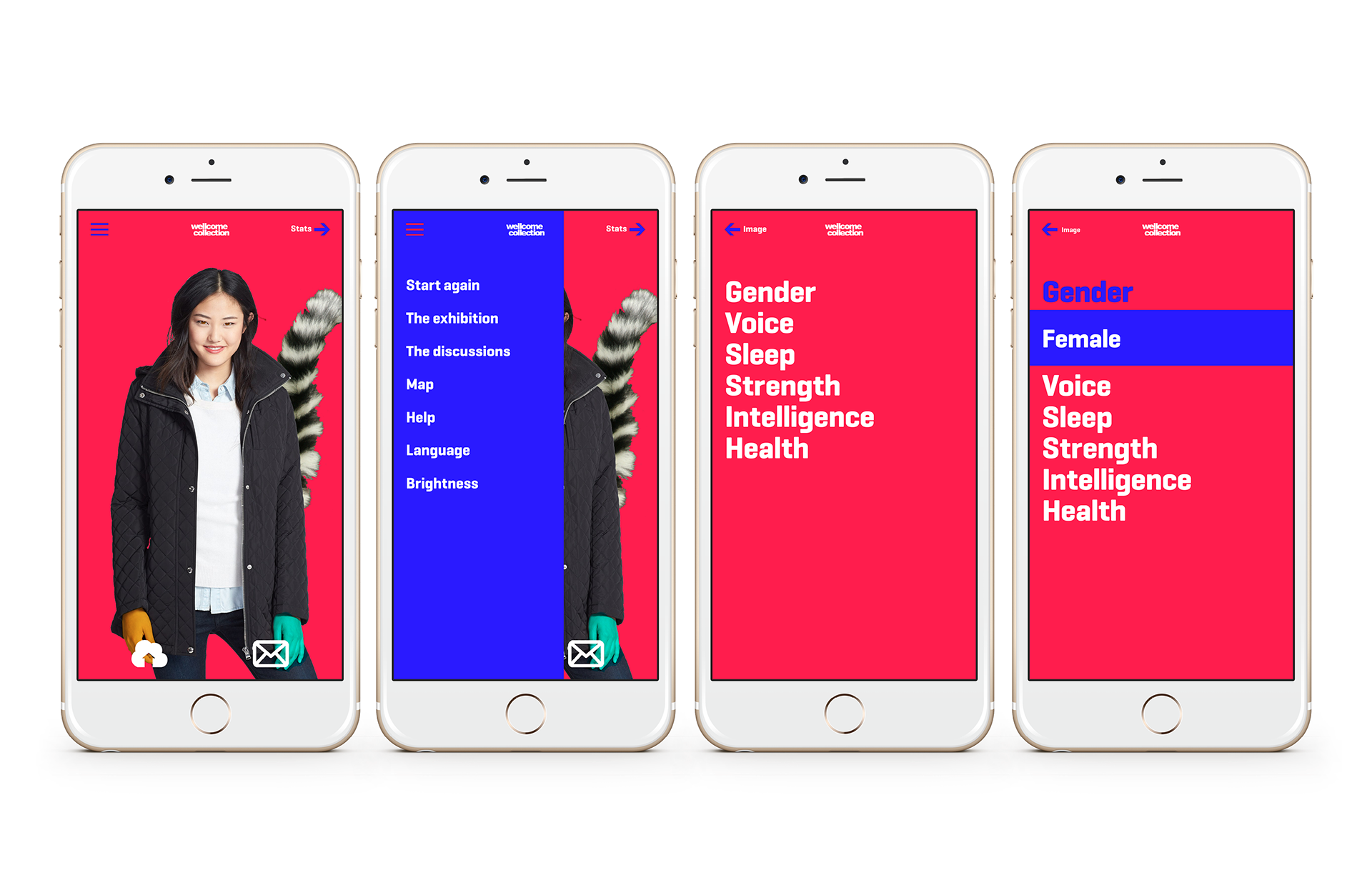
App
In the Wellcome Collection, they have touchscreen devices that can be used for free. The exhibition makes use of these by using them to take the photo of the visitor, they then take this touchscreen device round the exhibition with them where they can view the changes they are making to their genes and the effect it is having.
It alters their image to show the changes, as well as there being a screen you can flick to so that the stats are visible that can not be seen on an image.
At the end of the exhibition, they can email the image and stats to themselves and upload it to the website.
Exhibition
For the exhibition graphics, touchscreens are used. Each screen is interactive and is what visitors press to select and make changes, these changed then appear on their individual touchscreen device.
On these digital displays, the typeface explains what each screen is, will modify. The typeface gets more and more modified as the exhibition goes along. As visitors to the website create more letters for the typeface the digital screens can update and morph into new versions of the letters.

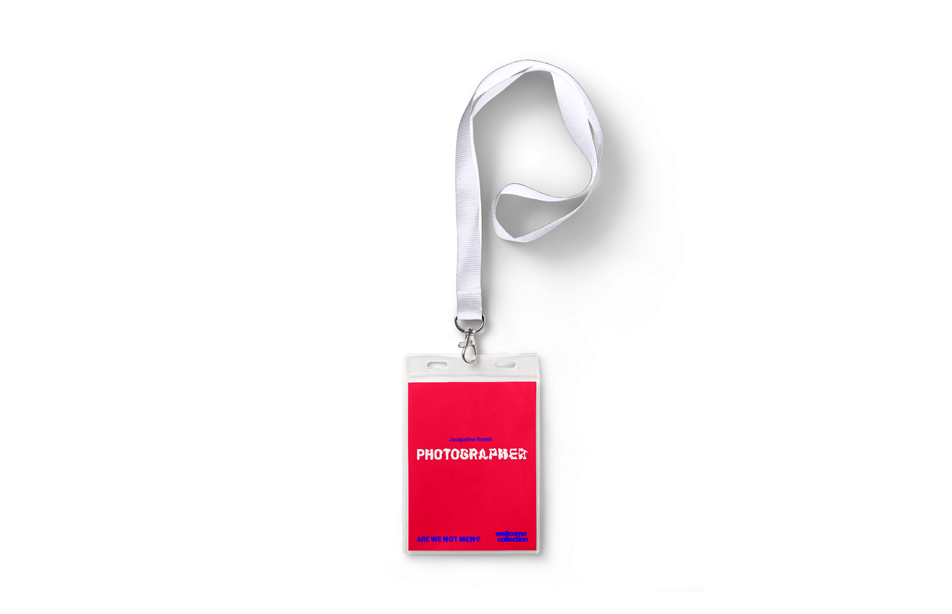
ID card
ID cards to be worn by the photographer to identify them and make it clear who the visitors should go to so they can collect their touchscreen device and have their picture taken to starts the experience.
The booklet
The catalogue has various articles that will make the visitor think, it talks of different interesting ethical and moral issues. The writing for these articles is placed on different sides of the booklet depending on if what it is saying is over the line or not, using the gutter of the book as the line. It is read from top to bottom with a line using the pattern in the type to follow to read it in the right order.
The titles become more and more modified as they progress through the booklet. As the viewer's knowledge and thoughts change and progress so does the typeface.
The paper used reflects the topic with glossy bright white paper and a matt laminated cover, so the paper and cover is also modified.